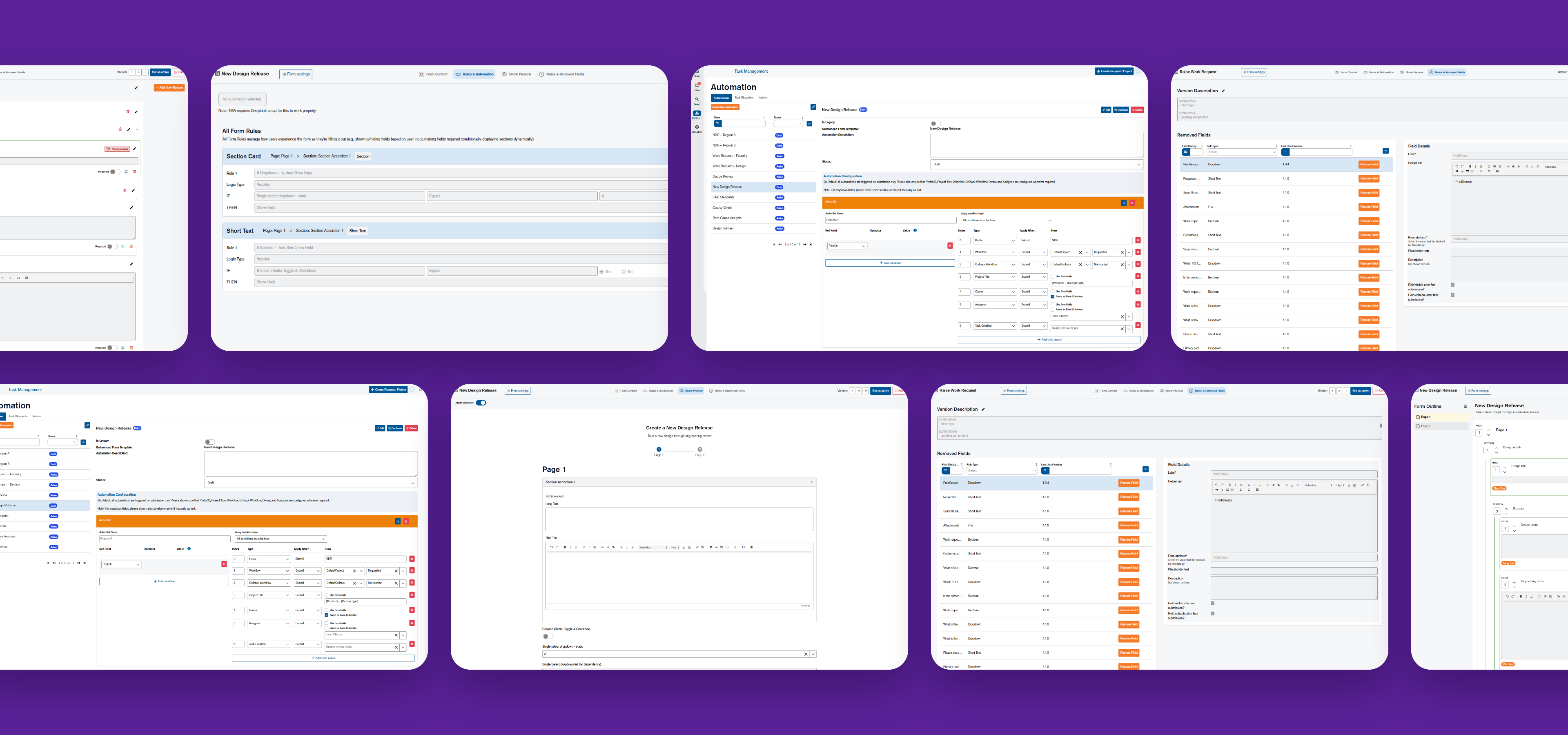
Cover story · Enterprise · Dec 2025 → Oct 2026

Form Builder: from paid requests to self-managed forms

I designed a custom Form Builder app, that allowed our global engineering manufacturing client to manage their own forms and projects, rather than outsourcing every time.

Form Builder
Task app automations
Each submission triggers its automations
Credits
Role
Product Designer: core design, requirements, test cases
Team
1 PM · 2 designers · 3 developers · QA intern
Timeline
Dec 2025 → Oct 2026
Client
Global engineering manufacturer · 9 departments · 6 countries
Platform
Built on Mendix
In short

We'd built our client a custom task app. But every new team or project still had to come through us. Form Builder gave them the autonomy to develop their own.

A couple of years ago we built a custom task management app for a 2,000-person engineering client. But every time they needed a new project type, we had to custom build its form, and that cost time and money. I designed the core features of the Form Builder app that allowed admins to build those form templates themselves, from the first audit of 17 legacy forms through to the requirements, UI and test cases.

i

Everything you'll see here is a stylised recreation. Real screens, data and client details stay under NDA, so I've abstracted the interfaces down to what matters for the story.

4
benchmark forms recreated, including the two most complex
2
deployment simulations with UAT users, both smooth
17
legacy forms audited across the client's departments
OCT
2026 go-live: the client builds new forms without a paid request
01
The problem

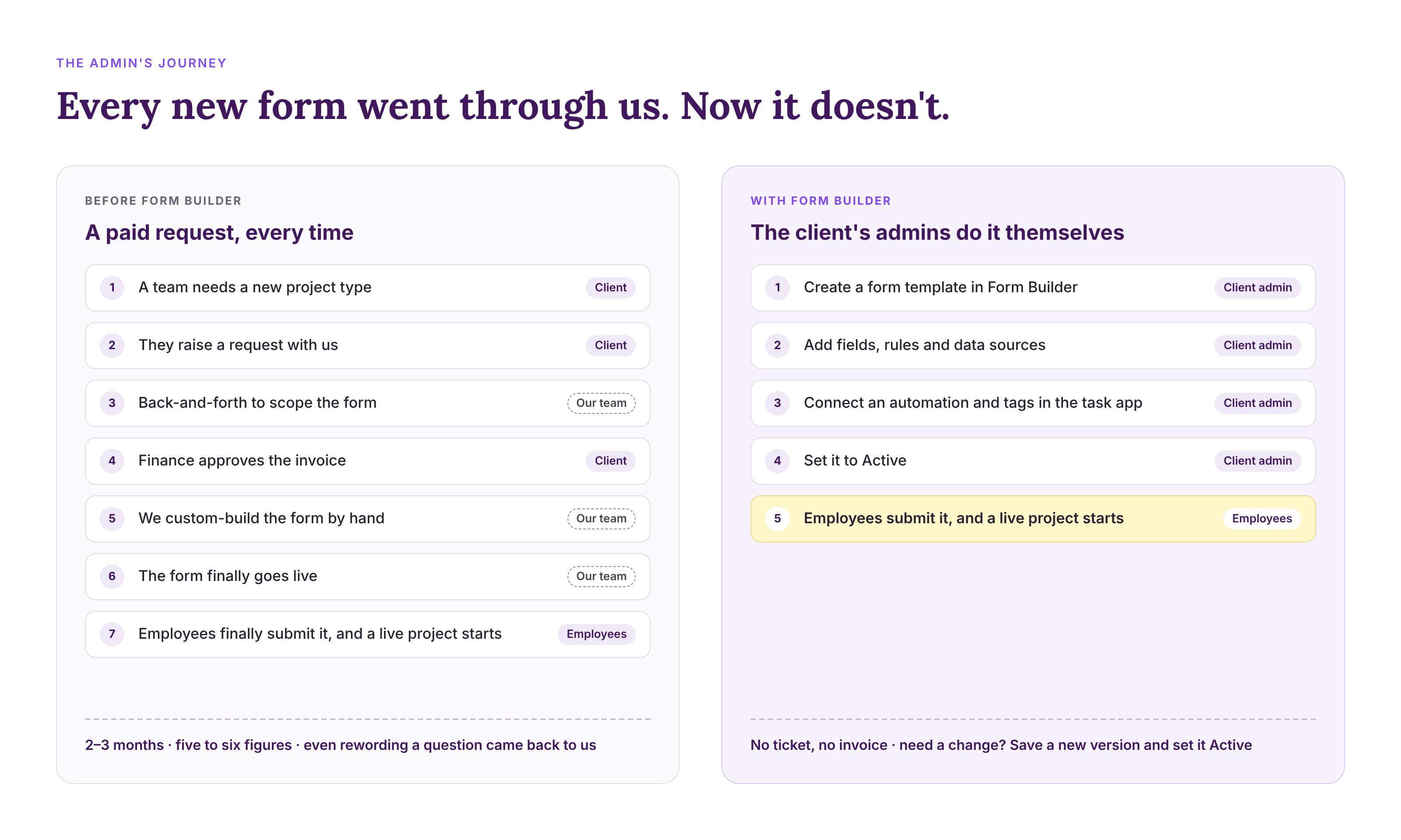
Every new process came with a price tag

Everytime our client needed a new project for their processes, they required our team to design and build it. The task management app we created allowed our client to submit a form that generates a live project with a Gantt chart view, task tree, owners and notifications. But every one of those forms was custom built, and each one took at least two to three months and cost five figures. 

We'd originally built the task app because, on Wrike, only 200 of their 2,000+ employees had licences. After some discussion, our client decided it was cheaper to own their own custom platform than work around off-the-shelf licences, with far more oversight. They've since retired Wrike and moved around 350 people onto the task app.

But growing it was still manual and outsourced. Many of the processes they wanted were simple, yet each new one came with a price tag, so only some departments were ever covered. Together, the task app and Form Builder replace what Wrike used to do, on a platform the client can direct.

What if the client admins could build their own forms instead?

02
The solution

Admin can create their own forms, connect it to an automation and submit live projects.

We designed Form Builder, where Admins build their own forms, connect it to an automation in the task app, and every submission becomes a live project.

The primary scope/requirements the client outlined at a high level included:

  • Ability to build forms: with various field types, sections, validation, tooltips, display names
  • Data sources: dropdown lists, value IDs and, in a future phase, live integrations
  • Logic & automation: show/hide visibility rules, filtering, automations, branching
  • Lifecycle & governance: versioning, statuses, permissions
  • Fitting into the task app: form attributes, tags, filters, project creation

Stylised recreation for this case study

My other non-formal goals were "Making something very complex feel simple to a non-technical admin."

The benchmark for success was to recreate four of the client's existing forms, including the two most complex processes:

  • Work Request: raising work for the engineering foundries, from a design change to an existing product, to a design review, to a brand-new product
  • New Design Release (renamed): the project that takes a new design through engineering, covering gauge and design reviews, CAD standards, quality checks and root cause analysis
03
Research

First: what does a form mean in this context?

We were a small team: one PM, two designers, three developers and a QA intern. My design lead guided the direction and shared the heavy lifting. I owned the core design: discovery, precedent research, the UI, the requirements and the acceptance criteria and test cases. I also did much of the talking: walkthroughs, demos and defending design decisions with the client.

AI helped me scout competitors + mock up variations. the calls were mine

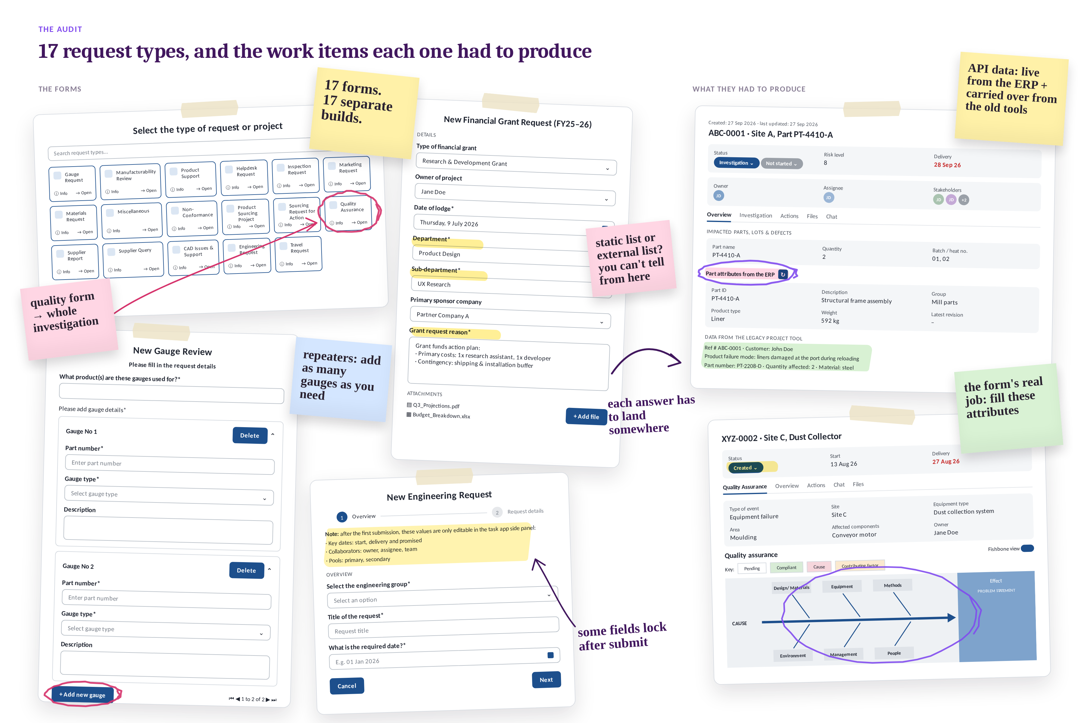
Before we got into it, some of my preliminary research was around defining the needs of the form, and researching precedents. I audited all existing forms in the task app, across our client's nine departments in six countries.

I mapped every field type, rule and automation they used into one large workboard: short text, long text, rich text, single and multi-select dropdowns, checkboxes, toggles, dates, file uploads and more.

17forms
9depts
6countries
27field types
15automations

Stylised recreation for this case study

04
Structure

Great, I know what the forms need. How do we structure this?

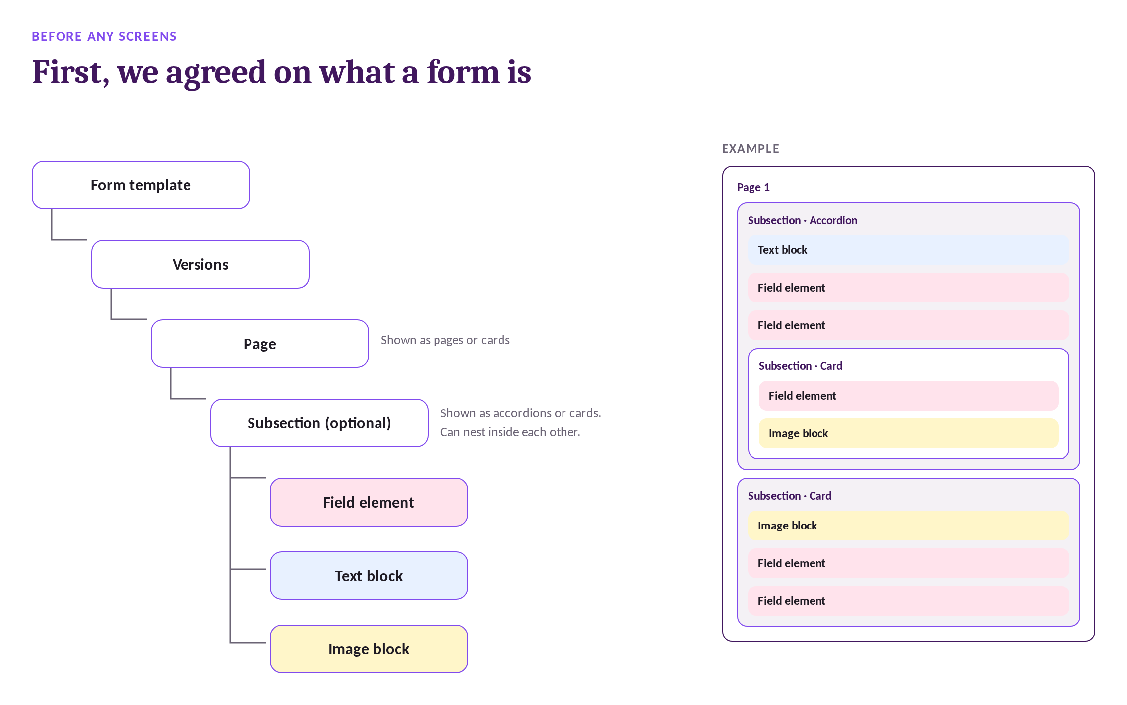
From that map, we agreed a shared structure for what a form is, and which app handles what. Then I explored competitor patterns and mock-up variations, and talked them through with the client to find what they really needed.

Stylised recreation for this case study

05
Challenge 1

Designing for the complexity of dropdowns

MUST HAVE: Flexible data sources

"It's just a dropdown"

Dropdowns seemed simple at first. A dropdown seems simple. An admin adds a field, types in Option A, B and C, and submitters pick one. But the audit kept asking harder questions:

But what if:

  • What if the dropdown has 500 options? Typing them out would take forever, and one typo would be almost impossible to find. The admin probably already has that data in a spreadsheet.
  • What if the dropdown list already lives in the task app, like the client's departments, teams and employees? We didn't want two sources of truth for the same list.
  • What if that list is live-synced from the client's ERP or HR system?
  • What if a second dropdown filters based on the first? Pick Product Group A, and Product Name only shows A1, A2, A3.

Stylised animation for this case study

My first design (when the scope was originally MVP) only handled static lists and Form Builder list source. Live integration was marked as a future phases in the roadmap. However after the first few demos to the developers, they flagged we’d be creating two sources of truth for data that already lived in the task app.

However, if the design only covers 10% of their forms, then while it was minimum, it wasn't viable.

The client also pushed that they would rather have a large phase 1 project to have more features and delay launch to make live data integration a core feature. So the final design outcome is that a dropdown can be a simple static list, a shared list, data pulled from the task app, or a live sync from an external system, with dependent filtering on top. To the admin, it's still just one choice: where do the options come from?

06
Challenge 2

Forms change, and people change

MUST HAVE: Strong versioning and governance

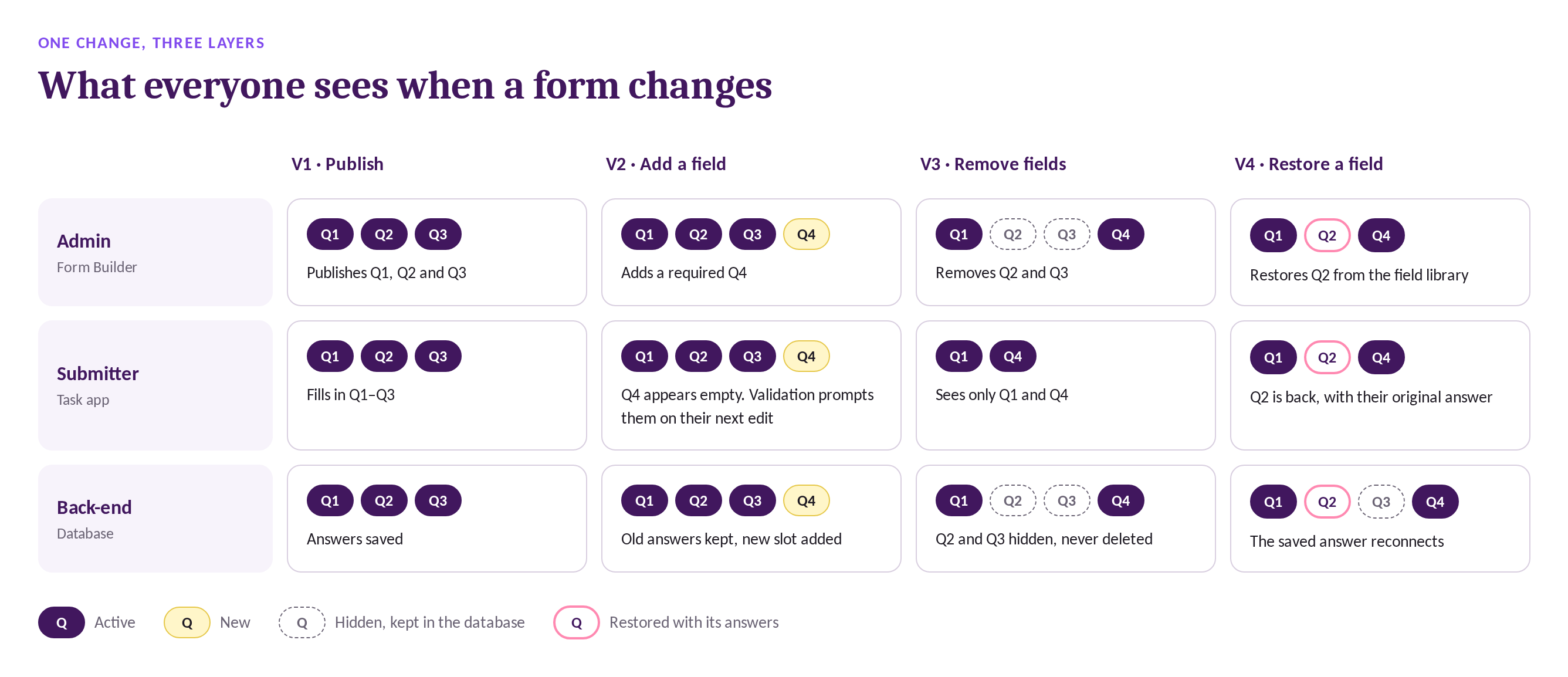
Forms change. A project someone started last month could be ongoing when an admin decides to edit the form. Our client stated they needed to have control in saving all versions & answers, be able to edit it and maintain a uniformed front end to all submitters. So the real question was: what should everyone see when a form changes underneath a live project?

Every change touches three layers at once: the submitter in the task app, the admin in Form Builder, and the database behind both.

The client needed three things to be true together:

  • Operational continuity: live projects keep running, and nobody's work breaks.
  • One consistent front end: submitters always see the latest version of the form.
  • A complete history: fields are never hard-deleted, and every answer is kept.

This raised even more what ifs:

  • What if an admin adds a field to an already live form?
  • What if an admin removes a field?
  • What if the admin restores it later? Submitters' original answers should also be srestored
  • What if a removed field was controlling a rule? Restoring the field doesn't safely restore the logic that depended on it.

The solution: the front end always shows the latest version, and the back end never hard-deletes. Removed fields are hidden, not lost. If an admin deletes a field that a rule depends on, that rule gets a red Needs Review badge, and "Set as Active" stays disabled until every flag is fixed. A broken form can't be published to submitters/

Stylised recreation for this case study

But who gets to make these changes?

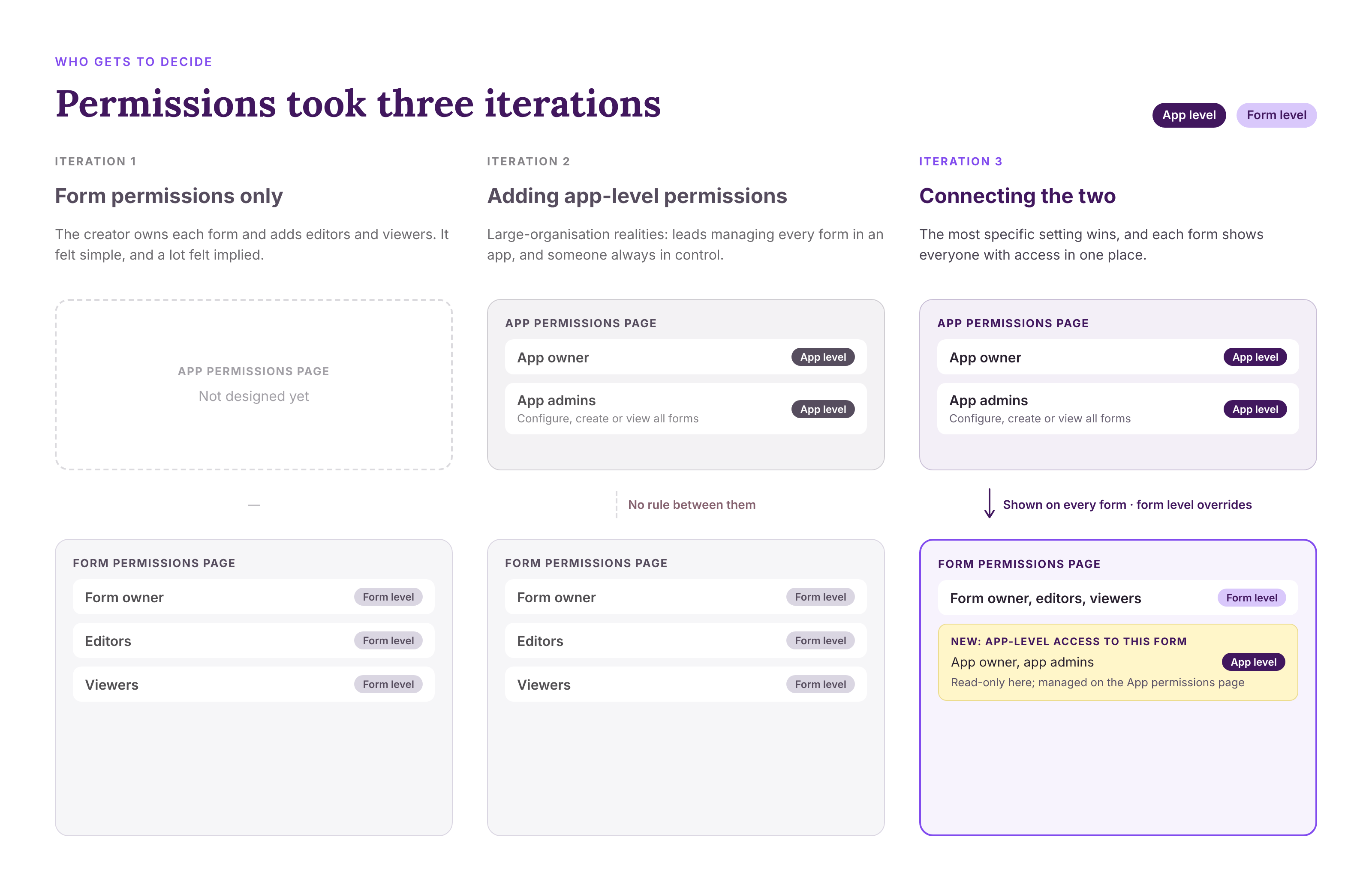
Versioning is only safe if the right people are making the changes. So we needed a permission system, and it ended up with two layers:

  • Roles decide who gets in. Form Admins can manage forms in Form Builder and submit them. Form Submitters can only submit forms in the task app.
  • Permissions decide what each Form Admin can do once they're in, at three levels: app owner, app-level (configure, create or view all forms in an app) and form-level (form owner, editor or viewer).
rookie mistake, nothing should ever be "implied"

My design of permission under went 3 major iteration phases. In iteration 1, I started with permissions on each form: the creator owns it and adds editors and viewers. It felt simple, and a lot of it felt implied.

Then, my design lead guided my direction to understand that there may be app level permissions that our client wanted to have control over. Perhaps a department lead wanted to control every form within a certain department, without being added to every single one. Some forms should only have create or view without seeing anyone else's forms etc. What if an editor invites other editors, would they have the same access as themselves or a more restricted version? Hence my second iteration define much of that.
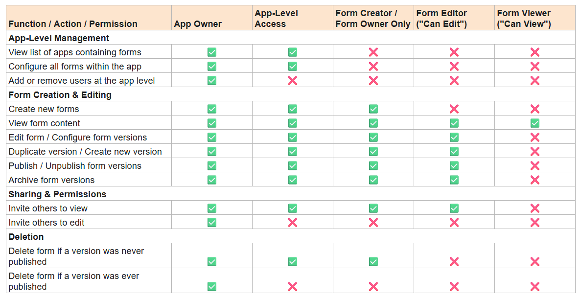
Rules table from the Form Builder FAQ documentation I co-curated

Lastly, I'd designed app permissions on the app page and form permissions on the form page, each in its own silo. Then the developers asked: "What can an app admin do on a form where they haven't been given explicit access?" There was no clear rule for how the two layers interacted, and no single place an admin could see it. I designed it so that any 'parent' permissions (such as App-level or App-owner) is displayed at form-level as well.

To keep those overrides visible, my design lead suggested showing app-level access on every form's permission page. With the client, we led with a simple "who can do what" table, to show the system rather than describing its rules.

So the essential learning here was: the permission logic was only half the work; making it visible was the other half. Like dropdowns, the job was making something complex underneath easy for an admin to use.
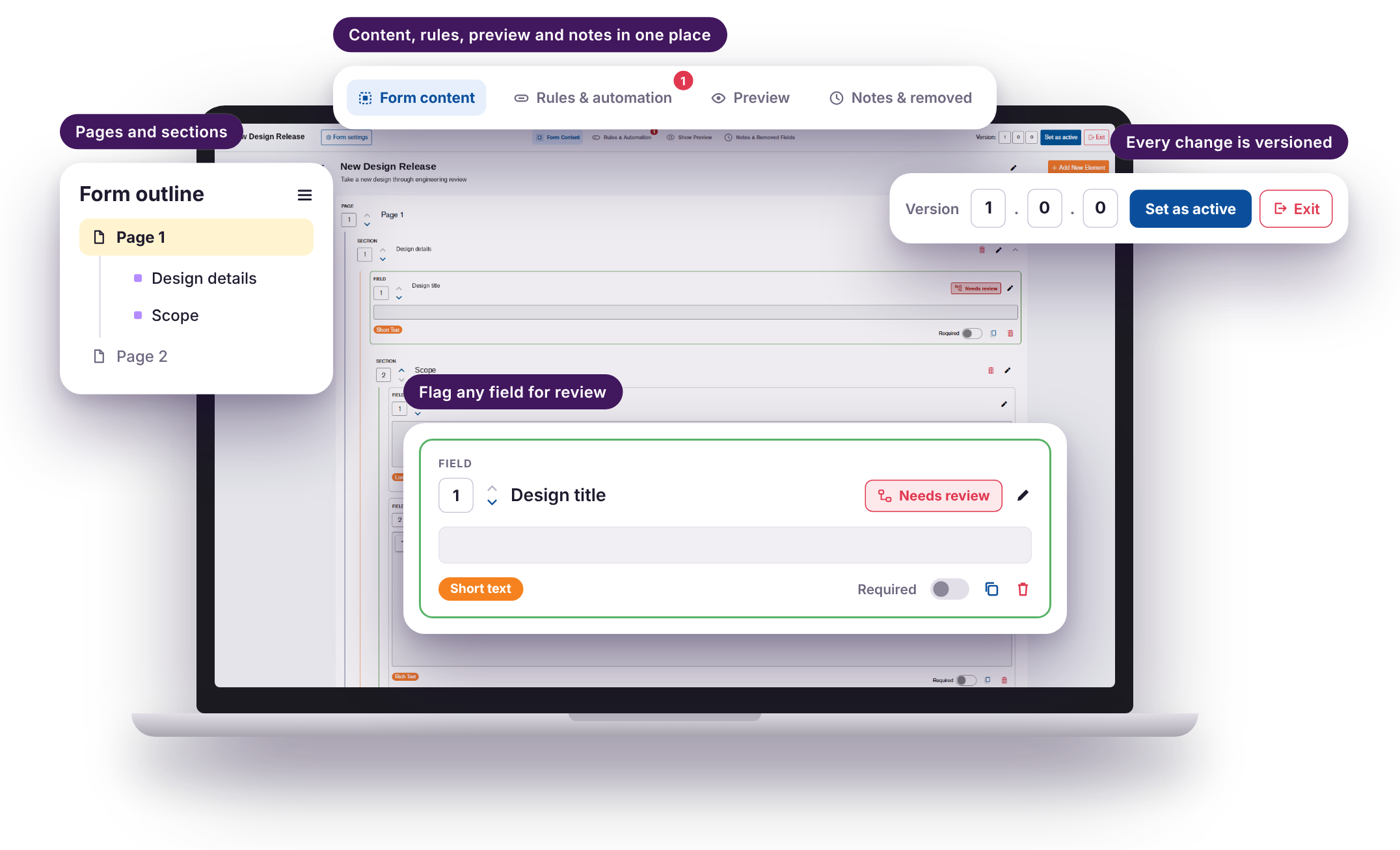
Stylised recreation for this case study

07
Challenge 3

Deep dive 3: Making automation make sense

MUST HAVE: On submission automation

Building a form was only half the job. The other half starts when someone presses Submit, and an automation in the task app turns their answers into a live project. This is where the next biggest complexity really lived.

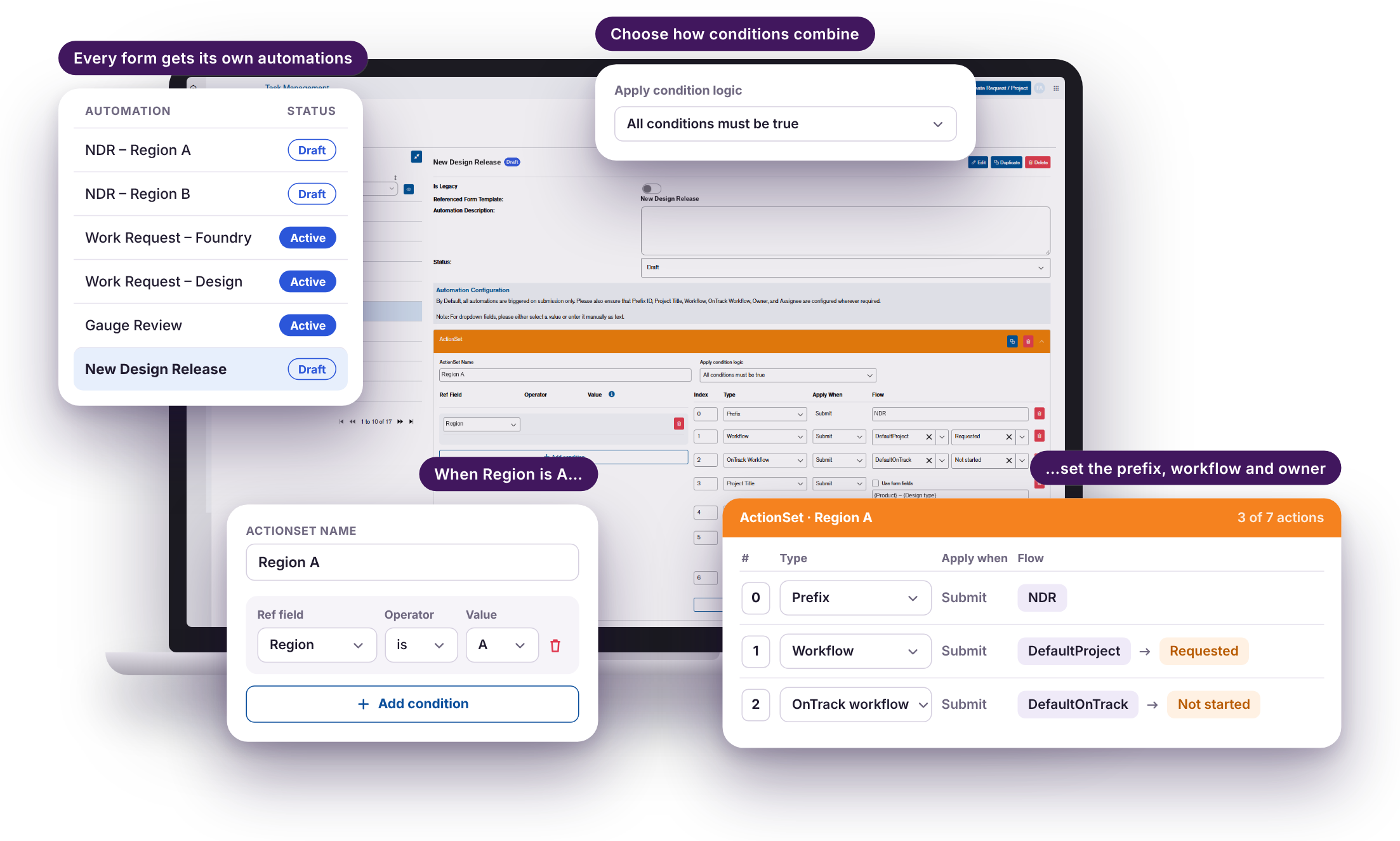
One early decision set the shape: automations live in the task app, and Form Builder links straight to them. That meant one place to manage them, not two.

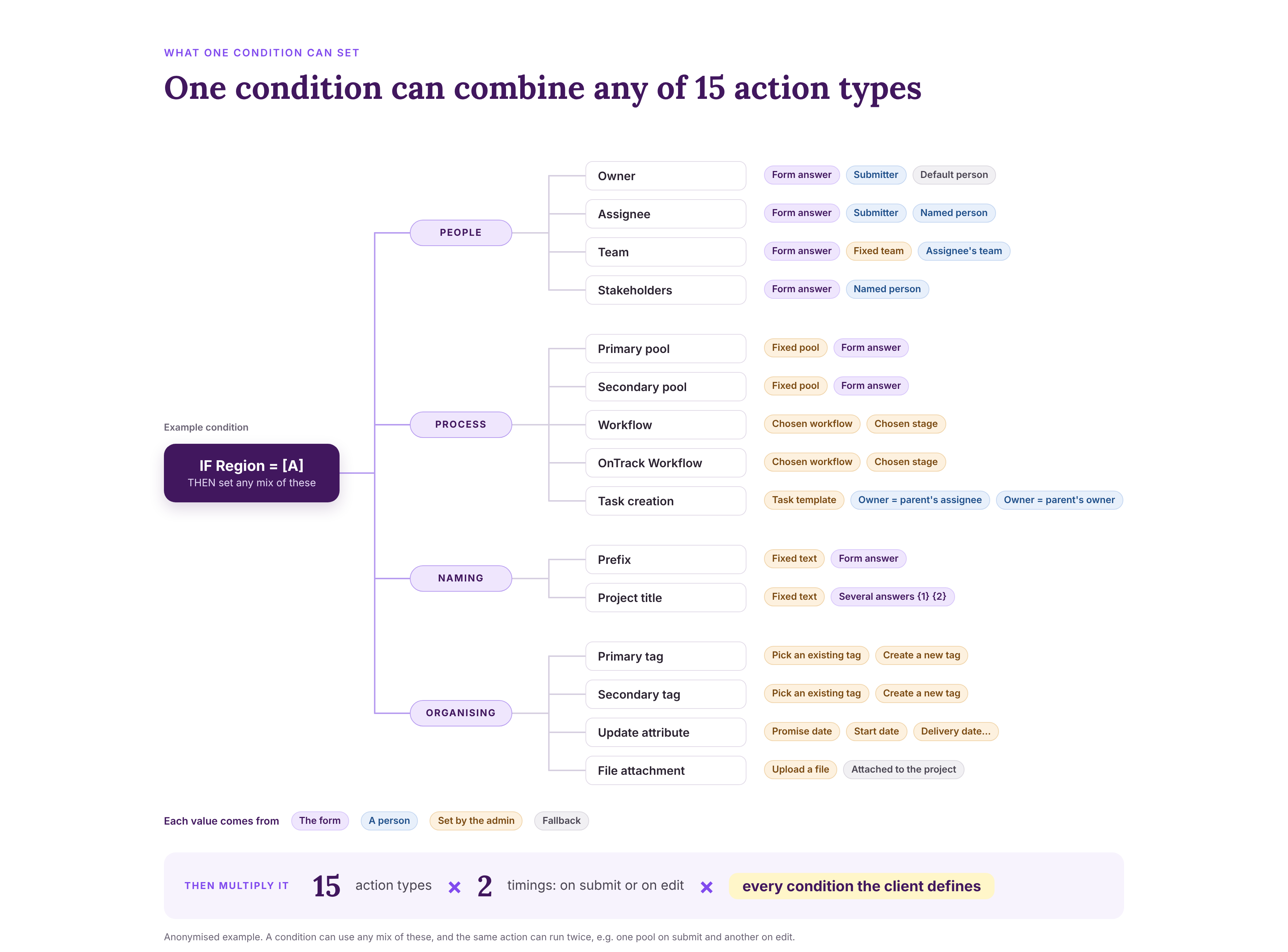
Automation scope had to allow admins to deine the following example scenarios:

  • For every project from this form tempalte, add the prefix "ABC".
  • If the answer is "Cat", Then make Jane the owner, set the primary tag to "Calico" and title the project "New Cat Project".
  • If field 1 is "Team A" OR Field 2 is "Region B", Then on submission put it in Pool A and rank it first; when it's edited later, move it to Pool B.

There were 15 action types, most with three or more ways to fill them, and all able to sit behind any condition. We built 159 test automations in the acceptance environment alone to be confident every combination held up.

Stylised recreation for this case study

Redesigned the automations to look great, but it was terrible to use.

To see what already existed, I logged into the task app as a developer admin and looked at the legacy automation screen. It was built entirely for developers: setting an owner meant writing something like IdentityAsOwner = "Value", case-sensitive.

I made it look friendly and non-technical, and organised it neatly by action type. You'd scroll to an action like "Owner", then add the conditions it applied to.

My first design organised automations by action type: pick "Owner", then add the conditions it applies to. It looked tidy, until I mapped real scenarios. Every action repeated the same IF logic, so one new scenario meant touching every action. Admins had to think backwards: do this, if this, this and this, then here's the trigger. Nobody thinks that way. People think if this, then do that.

So I redesigned it around conditions. Admins define the scenario once, then list everything it should do. I took both options to the client with worked examples, and we agreed together that organising by condition was clearer and would scale better.

My first version fixed how automation looked, but not how it thought. Lesson learned to consider functionality through practical lenses, and ‘neater’ or ‘simpler looking’ didn’t equate to ‘simple to use.

Stylised recreation for this case study

08
Reflection

Simple looking is almost never simple

This was the biggest project I've taken on. It started as what seemed to be a simple form builder, but it became closer to service design: roles and permissions, navigating between three apps, and deciding who is allowed to change what, and when.

For future projects, I’d be sure to remember:

  • Simple looking is almost never simple to implement, and especially not at an enterprise level
  • Design for existing mental models, not a perfect system in a vacuum. Twice, I designed around how the system was structured first. (App permissions, and automation) Both times, the fix was reorganising around how admins think.